

Last Updated: October 27, 2026
Quick Summary
To choose a watch dial design you'll wear daily, start with how you actually dress and work, then match dial color to your wardrobe and test readability in real lighting. Check dial size and proportion against your wrist, and make sure the dial agrees with the case metal, hands, strap, and movement layout.
- Answer three questions about dressing up, work environment, and metal you wear before looking at any dial.
- Black suits almost everything, especially dark suits, but can look flat in low light.
- Contrast is the luminance difference between hands and markers and the dial field.
- Lume only helps if applied generously to both hands and markers.
- Proportion is the number one reason a watch feels wrong after purchase.
Table of Contents
- Start With How You'll Actually Wear the Watch
- Watch Dial Colors: Match the Dial to Your Wardrobe
- Watch Dial Readability: Test It in Real Lighting
- Types of Watch Dials: Patterns, Layouts, and Markers
- Watch Dial Finishes: Sunburst, Matte, Enamel, and Guilloché
- Dial Size and Proportion for Your Wrist
- Match the Dial to the Case, Hands, and Strap
- Try a Haim Dial on Your Wrist Before You Commit
- Frequently Asked Questions
Start With How You'll Actually Wear the Watch
The fastest way to choose a watch dial design is to start with your week, not your taste.
So before you look at a single dial, answer three questions:
- How many days a week do you dress up?
- Do you work outdoors, at a desk, or on your feet?
- What metal do you already wear: gold, silver, or none?
Your answers narrow the field fast. A dial that suits a suit and one that suits a t-shirt are rarely the same dial.
Watch Dial Colors: Match the Dial to Your Wardrobe
Open your closet and count the dominant tones.
Here's how the main options map to wardrobes:
| Dial Color | Works Best With | Watch Out For |
|---|---|---|
| Black | Almost everything, especially dark suits | Can look flat in low light |
| White | Light shirts, warm tones, summer wear | Shows smudges and glare |
| Blue | Navy, gray, denim, most business wear | Clashes with brown-heavy outfits |
| Green | Earth tones, casual wear, olive and tan | Harder to pair with formal black |
| Bright colors | Statement pieces, weekend wear | Rarely suits a formal setting |
Watch Dial Readability: Test It in Real Lighting
Readability is one consideration when choosing a dial. Contrast, hand geometry, marker design, surface finish, and lume can affect legibility.
Contrast is the first filter
Contrast is the luminance difference between the hands/markers and the dial field. The fastest-reading dials create a clear value gap: dark hands on a light dial, or light hands on a dark dial. Low-contrast designs look elegant in photos but slow you down in motion.
Hand shape and marker style decide glance speed
Contrast gets you started; hand and marker geometry finish the job.
Lume: know what you are buying
The luminous compound on hands and markers determines night readability. The common families are:
- Super-LumiNova (grades such as Standard, BGW9, and C3), the industry baseline; BGW9 glows blue-white and C3 glows green, with C3 generally reading brighter to the dark-adapted eye.
- Old radium-style tints, warm, vintage-looking lume that trades brightness for aesthetics.
- No lume, common on dress watches; fine if you never check the time in the dark.
Lume only helps if it is applied generously and on both hands and markers. A dial with lume plots but non-lumed hands fails at night. Check that both hands are lumed and the 12 o'clock marker is distinct enough to orient you.
Test in the conditions you actually face
Before you commit, run the dial through these real-world checks:
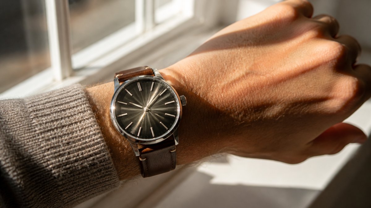
Readability and beauty can both be considerations when choosing a dial.
Types of Watch Dials: Patterns, Layouts, and Markers
For readers who want to see how far dial decoration can go, our guide to Top 10 Ornate Watch Dial Designs shows the range of patterns and layouts in real examples.
Watch Dial Finishes: Sunburst, Matte, Enamel, and Guilloché
If hand-finishing interests you, our complete guide to hand-finished watch dial techniques breaks down how each method is done. And before you commit, learn how to spot quality finishing in watches so you can judge the details in person.
Dial Size and Proportion for Your Wrist
Dial size is about proportion, not inches alone. A 38mm dial on a small wrist reads larger than the same dial on a broad one. The goal is balance: the watch should sit within the width of your wrist, not spill over the edges.
L2 Chronograph (Anniversary Edition) →
Measure your wrist circumference first. Then check two things:
- Case diameter: does the case sit inside your wrist's flat top?
- Lug-to-lug length: do the lugs overhang your wrist edges?
A dial that overhangs looks oversized no matter how good the design is; one that's too small can look lost. Proportion is the number one reason a watch feels wrong after purchase.
Match the Dial to the Case, Hands, and Strap
A dial can be considered alongside the case color, hands, strap, and movement layout underneath.
Case metal and dial color
The case metal sets the temperature of the watch. Steel is neutral and suits most dial colors, but finish matters: polished steel pairs cleanly with black, white, blue, and silver dials; brushed steel softens bright dials and suits matte finishes. Gold cases pair best with warm tones: cream, champagne, brown, green, and black. A cool blue dial in yellow gold reads as deliberate contrast rather than harmony. Two-tone cases are hardest to pair; a dial that repeats one of the two metals usually resolves the tension.
Hands must match dial complexity
Busy dials need simple hands; simple dials can carry more expressive hands. A chronograph with three subdials and a tachymeter scale already has a lot going on, baton or stick hands keep it readable. A clean three-hand dress dial can carry leaf or dauphine hands without clutter. The rule is agreement: if the dial is ornate, keep the hands quiet; if the dial is plain, the hands can be the detail.
Hand color should also agree with the markers. Polished hands continue the language of polished applied indices; white-painted hands keep printed white markers coherent. Mixing a polished hand with printed markers can look unfinished.
Strap material sets the formality
Strap material is the fastest way to dress a dial up or down:
- Leather (calf, alligator) dresses a dial up; it suits clean dials, slim hands, and formal cases.
- Steel bracelet is the most versatile; it dresses a sports dial down and can carry a simple dial into everyday wear.
- Rubber and textile dress a dial down; they suit bold markers, high contrast, and tool-watch proportions.
A formal watch usually pairs a clean dial with slim hands and a leather strap. A sports watch can carry bolder markers and a steel bracelet. If you swap straps often, choose a dial that reads well on both leather and steel, usually a matte or sunburst dial in black, blue, or white with applied indices.
Movement layout and dial design
The movement underneath constrains what the dial can do. A date window at 3, a small seconds subdial at 6, or a power-reserve indicator at 12 all change the dial's balance. Before you fall for a dial, check where the cutouts and subdials sit:
- Date at 3 is the most common and the easiest to live with; it breaks symmetry, so the rest of the dial should be balanced around it.
- Date at 6 keeps symmetry but can crowd a small dial.
- Small seconds at 6 adds vintage character but removes the sweep of a central seconds hand.
- Open-heart and skeleton dials trade legibility for showing the movement; they work best when the openwork is placed where the eye does not need to read the time.
A dial that ignores the movement layout looks arbitrary. A dial designed around it looks intentional.
A quick compatibility checklist
If you're building a formal look, our guide to dress watch design characteristics explains the proportions that make it work.
Try a Haim Dial on Your Wrist Before You Commit
Seeing a dial on your wrist is one way to assess its appearance. Light, skin tone, and wrist size can affect how it looks.
Our full collection of watches includes the Annum, with two dial variants featuring CNC guilloché patterns, and the Viajero SE, with hand-drawn maps on Grand Feu Enamel dials.


Frequently Asked Questions
How do I choose the right watch dial color?
Consider the clothes you wear most when choosing a dial color. Hold a candidate dial next to your three most-worn shirts before deciding.
What watch dial color is the most versatile?
White and black are the most versatile watch dial colors. A white or silver dial keeps legibility high in daylight and looks at home with a suit or a t-shirt. A black dial reads cleaner in low light and hides smudges better. If you want one watch for everything, pick one of these two and let the case finish and strap carry the personality. Textured or enamel versions of either color add depth without reducing how many outfits they suit.
How do different watch dial finishes affect a watch's appearance?
Finishes change how a dial handles light. A sunburst finish throws a rotating flare as your wrist moves, which makes flat colors look deeper. Matte finishes absorb light and keep the dial quiet and easy to read. Enamel gives a glassy, even surface that holds color for decades. Guilloché patterns cut fine ridges into the metal, so the dial shifts between light and shadow as you turn it. Durability differs too: applied finishes can wear at edges over time, while fired enamel resists fading.
How do dial size and layout affect readability?
Dial size sets how much room the markers get. A 38mm case with applied indices usually reads faster than a 42mm dial crowded with subdials and a tachymeter scale. Check three things: whether the hour markers are large enough to catch at a glance, whether the hands contrast with the background, and whether any complication overlaps the numerals. On a 6.5-inch wrist, a 38mm to 40mm dial keeps proportions balanced; larger wrists can carry 42mm and up without the dial overwhelming the case.
Choosing a watch dial design comes down to matching the dial to your real life, not a display case. If you want a dial built with that kind of care, Haim Watch Company offers hand-finished cases, custom-designed calibers, and ornate dial decoration across every piece. Explore the collection and find the dial you'll actually wear daily. Get started with Haim Watch Company and choose a watch that fits how you live.
